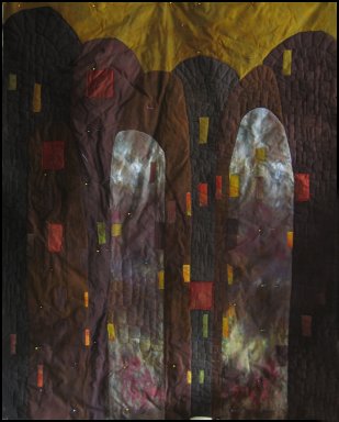
Friday brought great mail - this postcard for my new
favorite crack house and an acceptance notice from
Quilts=Art=Quilts
for "
Mudmen Procession". I have to think about how this piece should be shipped to minimize the creases in the acrylic paint.
The backsides of my work has been preying on my mind but
Rayna Gillman over at
studio 78 notes has eased my mind about a quilt's less-than-perfect quilt backsides by going public over the matter. Given the simplicity of my stitching you'd think that the backs of my pieces would be fairly tidy-
NOT!.
I'm sure my machine is overdue for a professional tuneup - the least little change in thread, top or bottom, or needle or fabric, for that matter is usually cause for nests, skipping and other hidden horrors. As long as things look hunky dory from the topside, I'm satisfied. Then I start to think about whether the jurors are going to spend any time looking "upskirts"as it were. I mean really, if you went into an art gallery and started lifting paintings off the wall to check the backs of canvases you'd be ejected . I am still so strongly tempted to go ahead with my idea of making pre-printed stitch or iron-on labels for the backsides of art quilts that say "WRONG SIDE STUPID!" or "NOSY LITTLE BASTARD, AREN'T YOU?" or
"WHAT THE F*CK ARE YOU LOOKING AT?". Think I could sell a few?
I've been stitching on a piece started a long time back - it's been growing on me as it nears completion.
 No surprise that I had dreams last night about a variation on the same piece that demanded execution first thing this morning, I mean before sunup even.

I don't know what part pleases me more - the hand-dyed flannel, the color scheme or the little 3D tongues standing up smartly and being different colors from different directions. More of this to come for sure.
 Friday brought great mail - this postcard for my new favorite crack house and an acceptance notice from Quilts=Art=Quilts
for "Mudmen Procession". I have to think about how this piece should be shipped to minimize the creases in the acrylic paint.
The backsides of my work has been preying on my mind but Rayna Gillman over at studio 78 notes has eased my mind about a quilt's less-than-perfect quilt backsides by going public over the matter. Given the simplicity of my stitching you'd think that the backs of my pieces would be fairly tidy- NOT!.
  No surprise that I had dreams last night about a variation on the same piece that demanded execution first thing this morning, I mean before sunup even.

5 comments:
I love your 3D tongues! What a wonderful idea!! The visual interest and texture this adds to a piece has so many possibilities.....
And yes, I'd go for labels that pointed out to people that this was the back and private underwear really --> I've toyed in the past (though never done) a note that said something like "satisfied your voyeuristic tendencies yet?" :-)
Your imagination is so playful and fun....I love this....
cool inspirations! Thanks for sharing with us! Warm regards Barbara
and I love the labels...maybe something with velcro, so we could add them at will when we think it's necessary. If it's of any interest, Susan Shie (Lucky) says that the back satisfies her as much as the front, no matter how messy it might appear to others. I say if you like it, that's all that matters - and if it matters not to you, then let the little 3D tongue take care of it on the back - yeah, that's it - put a 3D tongue on the label as a subtle (or not) comment!
I *still* worry if the back is neat enough--even on a rough edged, hairy, holey, scruffily textured piece---why do i do that? It must go back to when our mothers paniced about us in a car accident not wearing the good panties......Never mind the blood/texture, gore/technique, broken bones/colour scheme, spilled brains/image use--the panties are tidy and ladylike!
Post a Comment