Saturday, May 11, 2013

big blues


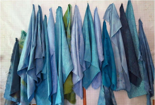
Even the commercial prints took the dye well. I should have cooled and warmed two of these just a little more but the summer is long and there's lots more white cloth..

I have another project that is pressing and will have to set aside this hands on stuff for a small ton of administrative work, starting with updating my main website. The biggest chore will be re-shooting all of my major pieces..sweat pours just thinking about it.

the Buggy Oatmeal brigade

Remember these from yesterday? After a rush of strong pure colors these are a complex and delicate breath of fresh air.  The blues are in the dryer and I'll get them ironed and up on the wall in a little while.


Friday, May 10, 2013

Sometimes the Blues

As I surveyed the proceeds so far I noticed a distinct lack of blue so first thing this morning I brewed up some blends, readied the cloth and made the plunge. The greens you see above are some over-dyes and a few commercial prints that needed some help.
I'm  making an attempt at replicating some of the nicer buggy oatmeal pieces from last summer..still have a large box that now sports some dead moths in it too.

There is also little pot of sunshine to balance everything out.

Wednesday, May 08, 2013

putting it all together


This is what I'm doing with the new cloth. Ironing damask completely changes the character of the cloth and brings out an iridescent quality that is hard to capture digitally.

This stitching is purely functional. It's a good thing that every one is a pleasure because this piece is 48x60 inches.

I'm afraid to admit to myself that I'm making up as I go, one piece of cloth at a time, as they relate to one another and not to the big picture.
The good thing about this technique is that it's pretty easy to snip a few stitches on the backside and remove or reposition an element. The cloth is very forgiving and there's lots of it.


First Fruits!


Thanks to everyone who commented and the private emails I received about these fabrics and my process. I'm taking the good advice and making up these samplers so you can try it out in your own work. I'll be working my way through the alphabet to name them - this is "Amphora".  The pale blue mottled piece, left center is linen, and everything else is vintage damask.

The ruler is up so you can see the scale and I've gone to some trouble to make sure this looks to my eye and my monitor as color correct as I can make it. That big golden triangle is a piece of the Butternuts from day before yesterday - the crew from yesterday are tumbling in the dryer right now and will be well represented.

I'll be posting these groupings for sale over at Random Acts of Dyeness and hope to get a half dozen up this morning.

To the far right, you can see a piece of a direct print of one of the Reveres -  a good example of what I do with my hand dyes -

here's a better look. Printed on card stock, 11"x17"